An App that helps people in San Francisco and the Bay area to find easy parking spots that are affordable, safe, available, efficient and user friendly. We are the Airbnb for car owners
Sweet Spot Parking


My Role: Ux/UI Designer & Researcher
Project Type: Mobile App
Project Timeline: 12 weeks
Our Approach: Design Thinking Process
Discover: User Information, Business Goals
Define: User Metrics, Product Flow
Ideate: Gather Design Ideas
Prototype: Design Layout
Test: User Feedback
PROBLEM
"SF has one of the densest concentrations of cars on the planet, more than any peer city in USA” -San Francisco Bay Guardian
San Francisco is a city of 815.000 habitants where 10.000 vehicles are registered per square mile.
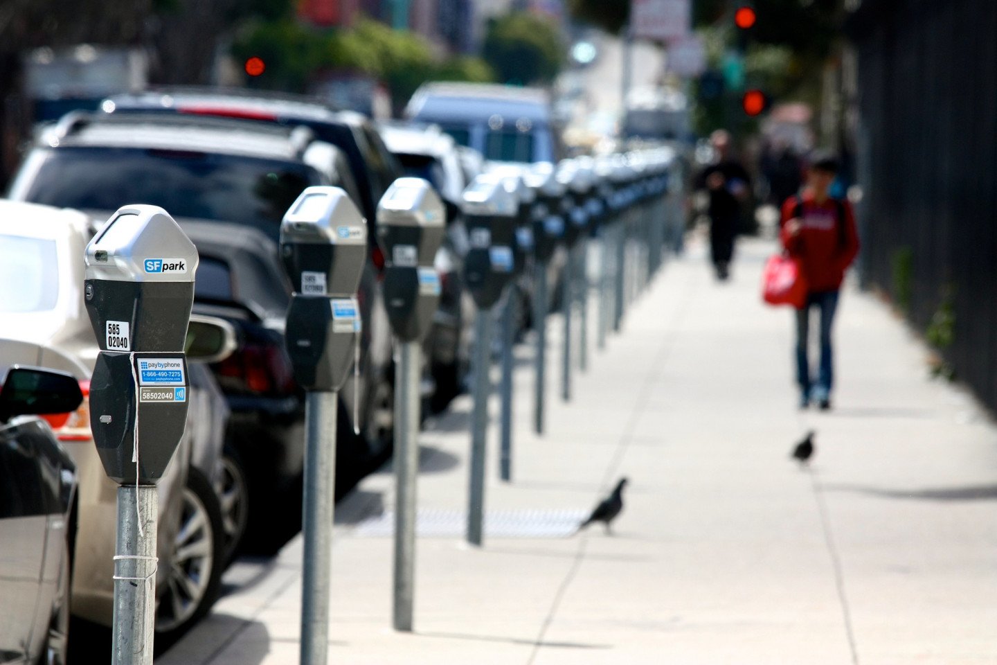
Parking in the city is one of the most stressful and expensive things in San Francisco as the city has some of the most valuable land on earth.
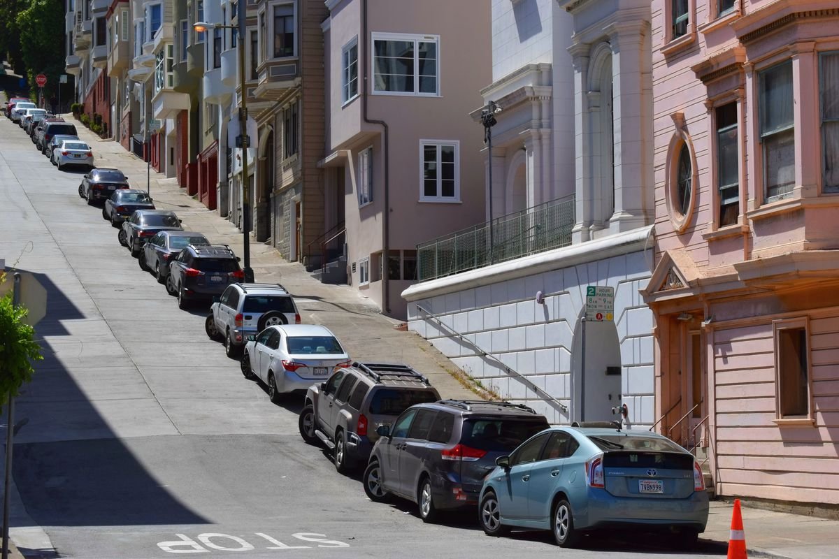
There are not enough parking spaces in the city and cars are constantly towed. Finding a parking spot is very time consuming and hard to find specially during peak hours and on the weekends.
Even though there is an App helping car owners to find public parking spots, there is not any connecting car owners with private parking owners.
Sweet Spot Parking was created to solve this problem, making parking in the San Francisco Area easier by having an App that find private parking spots to rent out. In other words, Sweet Spot Parking is the "Airbnb" of parking.
Challenge: Finding a way to manage affordability, safety, availability and efficiency at the moment of finding a parking spot.
Our objective: Create a leader parking App in San Francisco that points out the available private owned parking spots in the city in a matter of seconds based on proximity, availability, safety and affordability for the user.
After our recruitment, we interview 28 people that are car owners and live in the Bay Area but work in San Francisco.
Industries: Tech, finances and Hospitality.
We came up with a brainstorming exercise with the possible solutions to help car owners find parking spots. Afterwards we created a Mental Model to be able to understand and frame the Journey Map.
And we prepared for the prototype phase choosing a style guide for our App features.
Insight 1: Finding a Parking Space
We had first the first screen asking for the location of the user, but through the testing we realized it was not necessary to ask about this because of the location feature of the mobile phones that generate it automatically.
In the second screen when users had to select between "available right now" and "book a space"users were confused by the terms because there was not a clear understanding of the difference between the two choices.
We decided to change it so when the user opens the app it will show immediately “available right now” with the price and the distance. Once the user tap into the spot, it will appear all the details. This is more usable friendly and predictable. Everything needed can be accessed from the main screen.
Insight 2: Date Selection
The objective was to allow users to book future reservations. It is possible that the person would use that screen to select specific times on specific days. Nevertheless, the calendar selection process was very confusing and complex for the participant.
Many of the participants expressed through the testing that it was not necessary to have a future booking process in the case of parking a car, since it could be something that could be not possible to know exactly. They communicated that they found better to find parking "Now". For this reason, we simplified it so the user searched for parking when they need it.
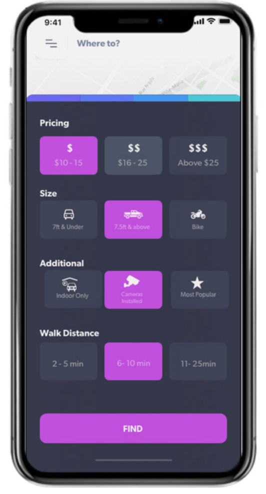
Insight 3: Filter Upgrade
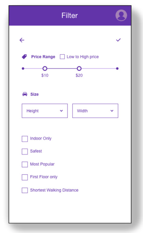
The original filter was very basic and not appealing.
We updated in a way that the finalized filter section was broken down into categories that were useful to the user. Sub category buttons were added making the decision making process simplified.
Discover
Ideate
Define
DISCOVER
DEFINE
Test
Prototype
IDEATE
PROTOTYPE
Low Fidelity Wireframes
TESTING
High Fidelity Wireframes
Mock Up Examples
Testing Video


